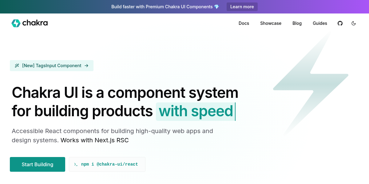
Chakra UI
Chakra UI is a component system for building products with speed. Accessible React components for building high-quality web apps and design systems.
Chakra UI helps teams ship polished, accessible React applications faster with a comprehensive component library that works beautifully out of the box.
Unlike copy-paste solutions like Shadcn UI, Chakra UI provides a complete design system with pre-built, theme-aware components that maintain consistency across your entire application. Its thoughtful API design and built-in accessibility features mean you spend less time wrestling with implementation details and more time building features your users actually need.
Key Features:
- Accessible by default: ARIA-compliant components that follow WAI-ARIA guidelines without extra configuration
- Flexible theming system: Customize colors, typography, and spacing globally with a unified design language
- Composable components: Mix and match building blocks to create complex interfaces quickly
- TypeScript support: Full type definitions for confident, error-free development
Who It's For: Chakra UI is ideal for product teams, startups, and developers who need to move quickly without sacrificing quality or accessibility. Whether you're building an MVP or scaling an enterprise design system, it provides the foundation to create professional interfaces that work for everyone.
Start building faster with a component library that handles the hard parts for you.